- 인터넷은 우리에게 자유를 주었습니다. 저희는 자유를 얻기 위해 지식을 통합하고 체계화하고 공유합니다. 랜선 위 정글에서 살아남기 위해 저희는 시키는 일만 하는 꿀벌 대신 고객을 위해 창조하고 혁신하는 게릴라가 되겠습니다. Seenbuy.kr is now Aiforu.kr.
- 024042463
- 01032667931
- [email protected]
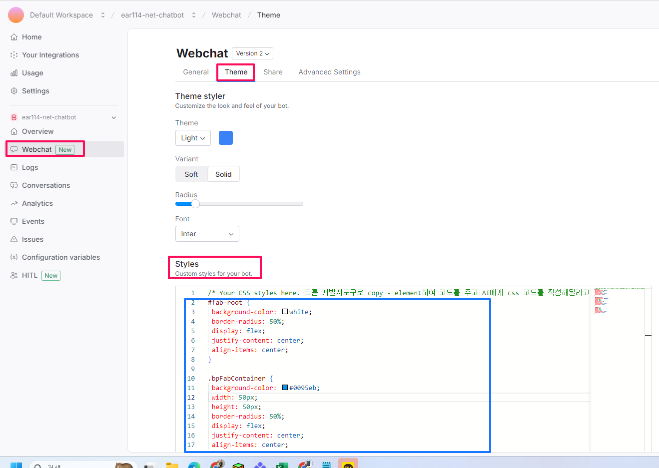
Botpress(botpress.com) : 2. 상세 사용법 – Botpress Docs 중 Webchat Customizeation(웹챗 맞춤화)

Chatbot Button

24.10.22 Memo
개편되어 css 코드를 Webchat-> [Theme] -> [Styles]에서 넣을 수 있습니다.
- 크롬 개발자도구로 copy -> element하여 코드를 주고 Claude, OpenAI 등에게 css코드를 만들어 달라고 하면 쉽게 코드를 생성할 수 있습니다. 이것을 파랑색 네모안에 넣으면 맞춤형 챗봇 버튼을 만들 수 있습니다.
- 플로팅 버튼 요소, 플로팅 버튼 내부의 아이콘 스타일, 플로팅 버튼의 알림 배지 스타일을 AI에게 알려주고 원하는 디자인을 요구하면 최적의 맞춤형 css 코드도 쉽게 만들어집니다.
아래 CSS를 사용하여 Chatbot 버튼을 사용자 정의할 수 있습니다.
이 클래스는 플로팅 버튼 요소의 스타일을 지정합니다.
.bpw-floating-button {
    /* 컨테이너의 오른쪽에 버튼을 정렬합니다. */
    float: right;
    /* 버튼 아이콘의 채우기 색을 설정합니다. */
    fill: rgb(255, 255, 255);
    /* 버튼에 마우스를 올리면 커서를 포인터로 변경합니다. */
    cursor: pointer;
    /* 버튼을 클릭하면 테두리를 제거합니다. */
    outline: none;

    /* 버튼 요소 내부에 아이콘을 가운데에 배치합니다. */
    display: flex;
    align-items: center;
    justify-content: center;

    /* 버튼이 다른 요소 위에 있도록 z-index를 설정합니다. */
    z-index: 1;
    /* 버튼의 너비와 높이를 설정합니다. */
    width: 52px;
    height: 52px;
    /* 버튼에 마우스를 올리면 커서를 포인터로 변경합니다. */
    cursor: pointer;
    /* 버튼의 모서리를 둥글게 합니다. */
    border-radius: 50%;
    /* 버튼에 그림자 효과를 추가합니다. */
    box-shadow: 0 2px 6px 0 rgba(0, 0, 0, 0.4);
    /* 버튼에서 넘치는 콘텐츠를 잘라냅니다. */
    overflow: hidden;

    /* 버튼에서 패딩과 테두리를 제거합니다. */
    padding: 0;
    border: none;
    background-clip: padding-box;

    /* 버튼의 크기가 변경될 때 전환 효과를 추가합니다. */
    transition: width 1s, height 1s;
}
해석:
float: right속성은 버튼을 컨테이너의 오른쪽에 정렬합니다. 이는 버튼을 화면의 하단 모서리에 배치하여 사용자들이 쉽게 접근할 수 있도록 하는 데 유용합니다.fill속성은 버튼 아이콘의 채우기 색을 설정합니다. 이 경우 아이콘은 흰색입니다.cursor속성은 버튼에 마우스를 올리면 커서를 포인터로 변경합니다. 이는 사용자에게 버튼이 클릭할 수 있음을 나타냅니다.outline속성은 버튼을 클릭하면 테두리를 제거합니다. 이는 버튼에 더 매끄러운 모양과 느낌을 줍니다.display속성은 버튼 요소 내부에 아이콘을 가운데에 배치합니다. 이는 버튼이 크기가 조정되더라도 아이콘이 항상 표시되도록 합니다.align-items속성은 버튼 요소 내부에 아이콘을 수직으로 가운데에 배치합니다.justify-content속성은 버튼 요소 내부에 아이콘을 수평으로 가운데에 배치합니다.z-index속성은 버튼이 페이지의 다른 요소 위에 있도록 설정합니다. 이는 버튼이 항상 보이고 사용자에게 액세스할 수 있도록 하는 데 중요합니다.width속성은 버튼의 너비를 52픽셀로 설정합니다.height속성은 버튼의 높이를 52픽셀로 설정합니다.border-radius속성은 버튼의 모서리를 둥글게 합니다. 이는 버튼에 더 현대적이고 세련된 모양을 줍니다.box-shadow속성은 버튼에 그림자 효과를 추가합니다. 이는 버튼을 배경에서 눈에 띄게 하고 더 시각적으로 매력적으로 만듭니다.overflow속성은 버튼에서 넘치는 콘텐츠를 잘라냅니다. 이는 버튼이 너무 커지거나 페이지의 다른 요소와 겹치지 않도록 하는 데 중요합니다.padding속성은 버튼에서 패딩을 제거합니다. 이는 버튼이 가능한 한 콤팩트하도록 합니다.border속성은 버튼에서 테두리를 제거합니다. 이는 버튼에 더 매끄럽고 현대적인 모양
자신의 아이콘을 Chatbot 버튼으로 추가하려면 다음 코드를 사용하세요.
.bpw-floating-button {
    background-image: url(YOUR_URL);
}
이 클래스는 플로팅 버튼 내부의 아이콘 스타일을 지정합니다.
.bpw-floating-button i {
    /* 아이콘의 투명도가 변경될 때 전환 효과를 추가합니다. */
    transition: opacity 0.3s ease;
    /* 아이콘의 투명도를 완전히 표시되도록 설정합니다. */
    opacity: 1;
    /* 부모 버튼 요소에서 채우기 및 선 색상을 상속합니다. */
    fill: inherit;
    stroke: inherit;
    /* 아이콘의 너비를 부모 버튼 요소의 100%로 설정합니다. */
    width: 100%;
    /* 패딩을 제거하고 선 높이를 0으로 설정하여 아이콘을 가운데에 배치합니다. */
    padding: 0;
    line-height: 0;
}
해석:
transition: opacity 0.3s ease속성은 아이콘의 투명도가 변경될 때 전환 효과를 추가합니다. 이는 아이콘이 점차 숨거나 나타나는 부드러운 효과를 만듭니다.opacity: 1속성은 아이콘의 투명도를 완전히 표시되도록 설정합니다.fill: inherit;속성은 부모 버튼 요소에서 채우기 색상을 상속합니다.stroke: inherit;속성은 부모 버튼 요소에서 선 색상을 상속합니다.width: 100%;속성은 아이콘의 너비를 부모 버튼 요소의 100%로 설정합니다.padding: 0;속성은 아이콘에서 패딩을 제거합니다.line-height: 0;속성은 아이콘에서 선 높이를 0으로 설정합니다. 이는 아이콘을 가운데에 배치하는 데 사용됩니다.
이 코드는 부모 버튼 요소와 동일한 색상의 완전히 표시되는 아이콘을 만드는 데 사용됩니다. 아이콘은 또한 부모 버튼 요소의 크기에 맞게 조정될 수 있습니다.
이 클래스는 플로팅 버튼의 알림 배지 스타일을 지정합니다.
.bpw-floating-button .bpw-floating-button-unread {
    /* 알림 배지를 표시합니다. */
    display: block;
    /* 배지를 버튼의 오른쪽 상단에 배치합니다. */
    position: absolute;
    right: 2px;
    bottom: 54px;
    /* 배지의 너비와 높이를 설정합니다. */
    width: 20px;
    height: 20px;
    /* 배지의 모서리를 둥글게 하여 원형으로 만듭니다. */
    border-radius: 50%;
    /* 배지 내부의 텍스트를 가운데에 배치합니다. */
    line-height: 20px;

    /* 배지 내부 텍스트의 색상을 설정합니다. */
    color: #fff;
    /* 배지의 배경색을 설정합니다. */
    background-color: #ff5d5d;
    /* 배지에 그림자 효과를 추가합니다. */
    box-shadow: 0 0 4px 0 rgba(0, 0, 0, 0.4);
}
해석:
display: block속성은 알림 배지를 표시합니다.position: absolute속성은 배지를 버튼의 오른쪽 상단에 배치합니다.right: 2px속성은 배지를 버튼의 오른쪽에서 2픽셀 떨어뜨립니다.bottom: 54px속성은 배지를 버튼의 맨 아래에서 54픽셀 떨어뜨립니다.width: 20px속성은 배지의 너비를 20픽셀로 설정합니다.height: 20px속성은 배지의 높이를 20픽셀로 설정합니다.border-radius: 50%;속성은 배지의 모서리를 둥글게 하여 원형으로 만듭니다.line-height: 20px;속성은 배지 내부의 텍스트를 가운데에 배치합니다.color: #fff;속성은 배지 내부 텍스트의 색상을 흰색으로 설정합니다.background-color: #ff5d5d;속성은 배지의 배경색을 빨간색으로 설정합니다.box-shadow: 0 0 4px 0 rgba(0, 0, 0, 0.4);속성은 배지에 그림자 효과를 추가합니다.
이 코드는 버튼의 오른쪽 상단에 표시되는 빨간색 원형 알림 배지를 만드는 데 사용됩니다. 배지에는 흰색 텍스트가 표시되며, 그림자 효과가 적용됩니다. 배지의 크기와 위치는 CSS로 지정할 수 있습니다.
Chat Header
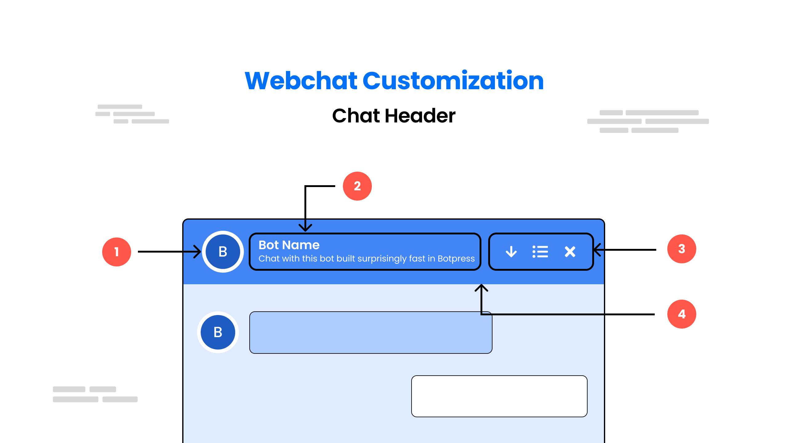
아래 CSS를 사용하여 Chatbot 헤더를 사용자 정의할 수 있습니다.
- 헤더 아이콘 스타일 지정
/* This block of CSS code styles a header icon element */ 처럼 영어로 된 코드 설명을 gemini로 번역하여 다시 코드로 올려주세요.
/* This block of CSS code styles a header icon element */
.bpw-header-icon {
  /* Remove border */
  border: none;
  /* Remove background color */
  background: none;
  /* Remove padding */
  padding: 0;
  /* Remove margin */
  margin: 0;
  /* Set text color to a variable named shark */
  color: var(--shark);
  /* Set line-height to zero */
  line-height: 0;
  /* Set left margin to a variable named spacing-large */
  margin-left: var(--spacing-large);
  /* Align text to the right */
  text-align: right;
  /* Align element vertically in the middle */
  vertical-align: middle;
  /* Set cursor to a pointer */
  cursor: pointer;
  /* Set fill color to a variable named shark */
  fill: var(--shark);
  /* Set width to 16 pixels */
  width: 16px;
  /* Set height to 16 pixels */
  height: 16px;
  /* Set fill transition duration to 0.3 seconds */
  transition: fill 0.3s;
}

/* Apply the same fill color and fill transition to the icon's SVG and path elements */
.bpw-header-icon svg,
.bpw-header-icon svg path {
  /* Set fill color to a variable named shark */
  fill: var(--shark);
  /* Set fill transition duration to 0.3 seconds */
  transition: fill 0.3s;
}

/* When the icon is hovered over, change the fill color to a variable named reef for the icon, SVG and path elements */
.bpw-header-icon:hover,
.bpw-header-icon:hover svg,
.bpw-header-icon:hover svg path {
  fill: var(--reef);
}- 헤더 제목 및 부제 스타일 지정
.bpw-header-title-flexbox {
    /* sets the overflow behavior of the element */
    overflow: hidden;
    /* sets the text overflow behavior of the element */
    text-overflow: ellipsis;
    /* sets the flexbox properties of the element for webkit browsers */
    -webkit-box-flex: 1;
    /* sets the flexbox properties of the element for Microsoft browsers */
    -ms-flex: 1 1 auto;
    /* sets the flexbox properties of the element */
    flex: 1 1 auto;
}

.bpw-header-title-container {
    /* sets the vertical alignment of the element */
    -webkit-box-align: center;
    -ms-flex-align: center;
    align-items: center;
    /* sets the display of the element to use flexbox for webkit browsers */
    display: -webkit-box;
    /* sets the display of the element to use flexbox for Microsoft browsers */
    display: -ms-flexbox;
    /* sets the display of the element to use flexbox */
    display: flex;
}

.bpw-header-title-container .bpw-bot-avatar {
    /* sets the display of the element to none */
    display: none;
}

.bpw-header-title-container .bpw-bot-avatar svg {
    /* sets the zoom level of the element */
    zoom: 0.6;
}

.bpw-header-name {
    /* sets the font weight of the element */
    font-weight: 500;
    /* sets the font size of the element */
    font-size: 14px;
    /* sets the color of the element */
    color: var(--zinc-600);
}

.bpw-header-subtitle {
    /* sets the overflow behavior of the element */
    overflow: hidden;
    /* sets the white space handling of the element */
    white-space: nowrap;
    /* sets the text overflow behavior of the element */
    text-overflow: ellipsis;
    /* sets the font weight of the element */
    font-weight: 300;
    /* sets the font size of the element */
    font-size: 12px;
    /* sets the color of the element */
    color: var(--zinc-400);
}

.bpw-header-unread {
    /* sets the display of the element to none */
    display: none;
}

.sr-only {
    /* sets the position of the element to absolute */
    position: absolute;
    /* sets the width of the element */
    width: 1px;
    /* sets the height of the element */
    height: 1px;
    /* sets the padding of the element */
    padding: 0;
    /* sets the margin of the element */
    margin: -1px;
    /* sets the overflow behavior of the element */
    overflow: hidden;
    /* clips the element to the given rectangle */
    clip: rect(0, 0, 0, 0);
    /* sets the border of the element */
    border: 0;
}- 메뉴 항목. (init 객체에서 이 값을 사용하세요)
| 사용자 정의 변수 | 변수 유형 | 기본값 | 설명 |
showConversationsButton | 부울 | true | false인 경우 대화 목록 창이 숨겨집니다. |
enableTranscriptDownload | 부울 | true | 사용자가 대화 기록을 다운로드할 수 있도록 허용합니다. |
enableConversationDeletion | 부울 | false | 사용자가 대화 기록을 삭제할 수 있도록 허용합니다. |
showCloseButton | 부울 | true | 웹 채팅이 열릴 때 웹 채팅 닫기 버튼이 표시됩니다. |
- 헤더 컨테이너 스타일 지정
.bpw-header-container {
    /* sets the border radius of the element */
    border-radius: var(--spacing-large);
    /* sets the background color of the element */
    background: var(--white);
    /* sets the border of the element */
    border: 1px solid var(--zinc-200);
    /* sets the border radius of the element (repeated declaration) */
    border-radius: var(--spacing-medium);
    /* sets the padding of the element */
    padding: var(--spacing-large) var(--spacing-x-large);
}
User Input Area
Show Bot Info
Full Screen Chatbot
Chatbot inside a div
상희 김
검색엔진최적화, 인바운드마케팅, 유튜브최적화 전문